North Carolina Board of Nursing (NCBON)
Modernizing a 120-year-old organization. Positioning them for future success.
The North Carolina Board of Nursing (NCBON) recently engaged The Marketing Machine (TMM) to embark on a rebrand journey that, ultimately, would culminate in a new original logo, a refreshed color palette and a reinvigorated voice.
Background
Established in 1903, the NCBON is the exclusive regulatory and licensing body for the practice of nursing in North Carolina. The NC State Legislature created it to ensure minimum standards of competency for nurses in the state and to provide safe nursing care to the public. At present, more than 175,000 nurses in NC are licensed with the Board.
With equity, integrity, and agility, the Board strives to uphold its mandate to protect healthcare consumers who receive nursing services. More specifically, the Board aims to:
- Promote legislative change that will improve nursing care and safeguard the public
- Fund vital programs and services for nurses, enabling innovation in nursing education and practice
- Strengthen collaborative relationships with external stakeholders
Project Goals a.k.a. The Assignment
Challenges
The Board found itself in a situation common among healthcare and related associations: how to stay fresh and relevant and be perceived to be on the cutting edge to ensure that branding, logo, business cards, and letterhead are current, vibrant and reflect the progress made and future direction of the organization.
Enter The Marketing Machine (TMM).
We are the rebranding specialists who have helped organizations understand their culture, their core message, and their audience to reimagine their brands with an originally crafted custom logo leading the way.
The Process
At The Marketing Machine, we follow a proven and multi-step iterative process designed to yield real insights, help foster consensus among key stakeholders, and inform creative development.
Our Solutions
Logo Design
We presented multiple logos and creative directions at various stages of the design process. Through a deductive process, we zeroed in on the options that captured the heart and culture of NCBON today and where the brand is headed.
All our logos aimed to visually telegraph the interconnectedness and transparency of the organization and communicate both its softness and strength.
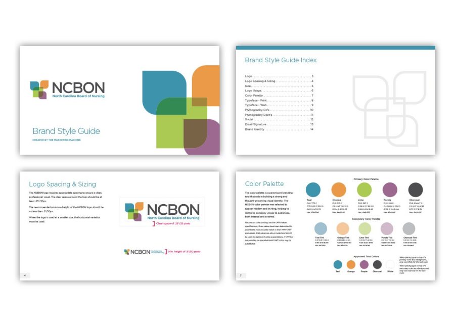
After presenting color as well as black and white logo options (a logo should be just as powerful even when it is in black and white), this was the winning logo design. In a contemporary and abstract way, it represented the four areas of North Carolina—mountains, piedmont, intracoastal and tidewater.

Here is a mockup of the selected logo in the client’s work environment.
Typography
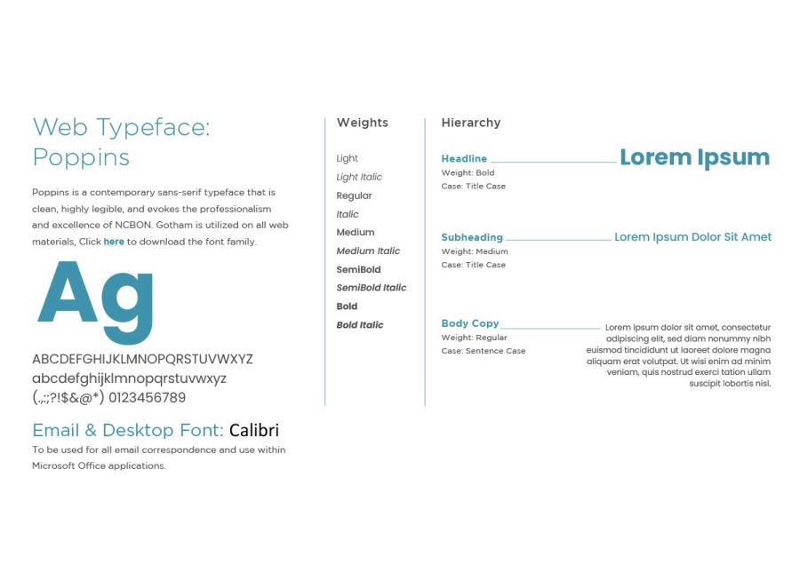
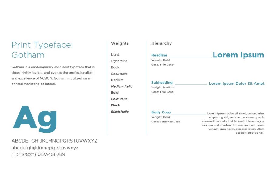
We introduced new typefaces into NCBON’s visual lexicon. We were deliberate in choosing a clean, sans-serif typeface that would evoke the professionalism and excellence of the organization while providing a modern look.
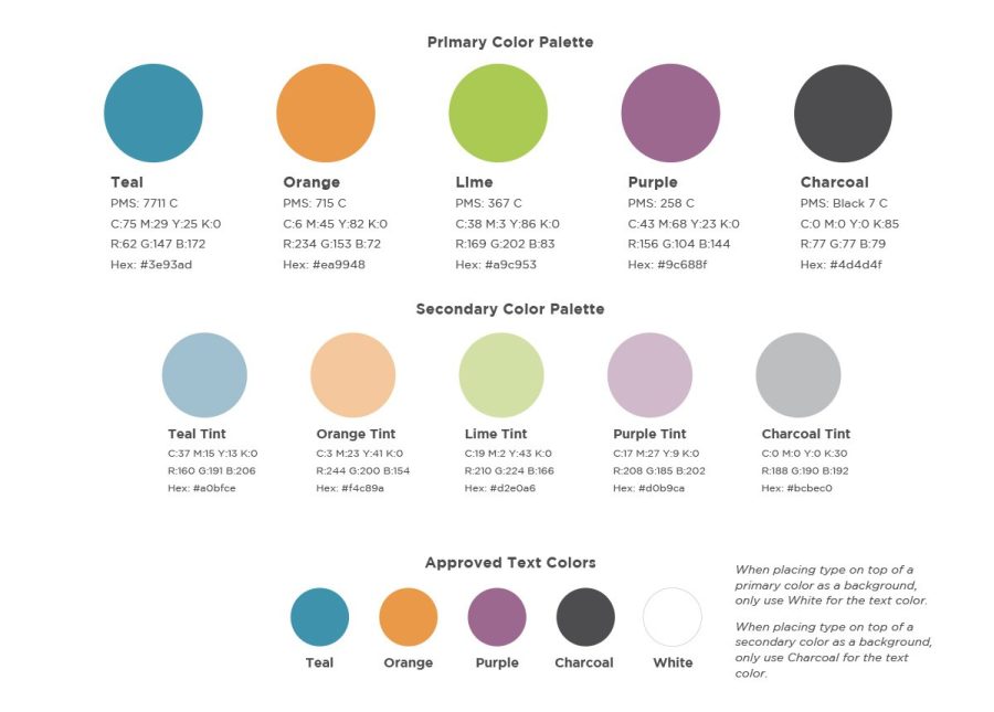
Color Palette
With color, we wanted to strike a mood that was calm yet cutting-edge. We chose colors that matched how the clients see themselves—polished, structured, modern and inclusive.

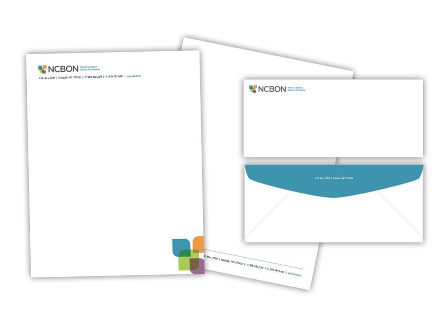
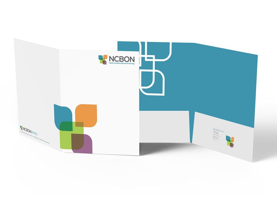
Letterhead & Folder Design
Applying the results.
The logo, typography and colors all converge to create a unique and ownable brand identity. Refreshed letterhead makes an immediate visual impact with readers and creates an inviting entryway into communication.
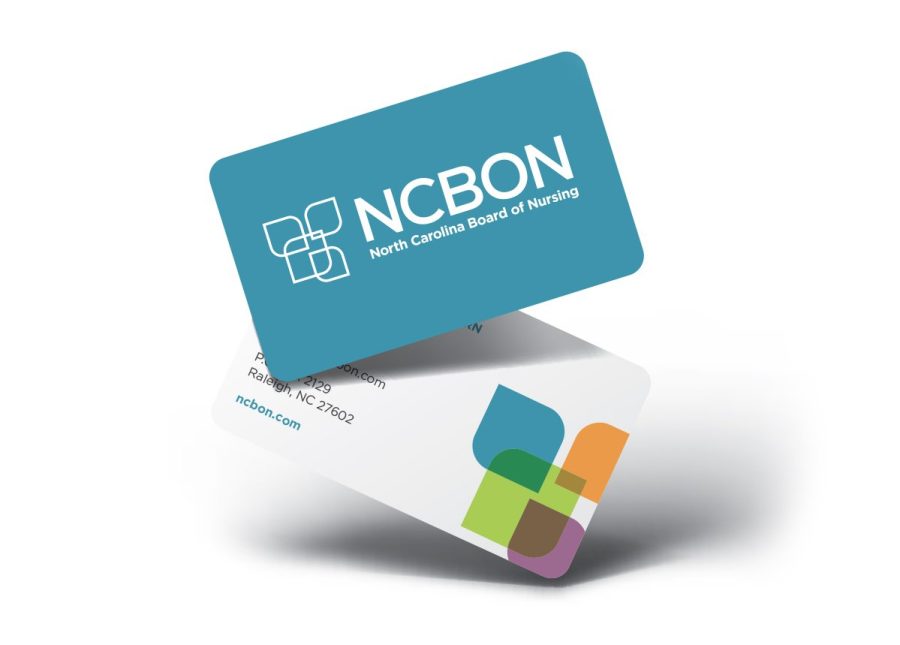
Business Card Design
A look that stands out.
We created two-sided business cards with rounded edges that were clean, modern, and striking. The goal: a card that elicits emotion and generates response.

Social Media Branding
Will it work on the web?
The success of any rebrand project is measured by its ability to work synergistically across multiple media platforms. For NCBON, we applied the new look to social media channels, giving the brand a hip yet authoritative presence.

Tangible Outcomes
A rebrand is more than a logo or a simple design exercise. It’s art with a purpose.
For us and NCBON, it was a journey toward capturing the essence of their organization now and positioning them for future success.
Now, with a stronger foundation, NCBNON is ready to connect with the hearts and minds of a new generation of nurses across North Carolina and move one step closer to fulfilling its vision of exemplary nursing care for all.
7 Key Achievements:
- We persuaded the client to deactivate old links and confusing portals and embrace simplicity.
- We helped them find common ground and make visual selections that appealed to all stakeholders.
- We created logos and established colors that aligned with their brand descriptors.
- We reimagined their color palette and revamped their entire brand identity.
- We helped apply our refreshed style to a new website launching soon.
- We transformed how their brand interacts with the outside world.
- We helped develop a rationale for the use of the NCBON acronym externally.