When it comes to branding, color is far more than an aesthetic choice—it’s a powerful…
The Top 3 Essentials for a Good Logo
Logos are everywhere—you probably see more logos than ads each day, 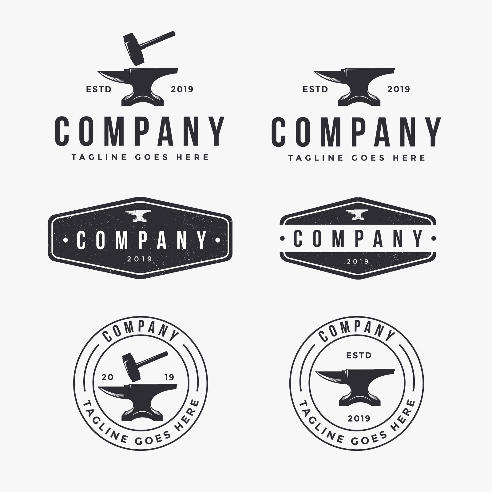 or over 6,000 a day—so when it’s time to create or refresh yours, it pays to prioritize these top 3 essentials for a GOOD logo:
- Expresses the brand’s essence, uniquely
- Simplicity
- Break the rules, strategically
Tuning in to these 3 critical factors will help your logo become an asset, not just a pretty design.
Expresses the brand’s essence, uniquely
To help us process information more quickly, our brains categorize what we see. So, when we see a logo, we unconsciously ascribe meaning to its different elements: the fonts, graphic icon, colors and text.
Collectively these elements indicate whether a brand is friendly, efficient, inspiring, modern, about animals or kids, techy, fun, corporate, elegant… you get the idea. Skilled logo designers use their knowledge of these meanings to create a logo that communicates a brand’s core difference, or essence: the style, culture, industry, personality and values associated with your organization.
A logo that doesn’t take these factors into account may be attractive, but if it’s neither “good” nor “yours”—it’s generic. In a nutshell, a good logo design grows out of your brand, it doesn’t create or define it.
Two common missteps to avoid:
- Giving in to the siren call of clip art: By its very design, clip art is intended to be universal. And since it’s available to everyone (even if at a small fee), using clip art increases the odds that you’ll see it in a competitors’ branding. Creating a distinctive logo requires a unique icon or graphic, or text styling (or both).
- Ignoring the competition in your market: To be sure your logo is a one-and-only, do a thorough review of the competitive landscape before and after exploring logo ideas. Depending on your geographic scope and long-term goals, it may even be wise to do a trademark search—and protect your finished logo by trademarking it.
Each element in the logo design matters. The designer’s challenge is to distill and pull together all the unique aspects of your brand into one single, simple image. An image that is as clear, communicative and compelling on a tiny business card as it is on a billboard! No small task, but the professionalism it delivers is what helps a good logo become one of your biggest assets.
Simplicity
Sometimes people aim to pack all their branding ideas into the logo. They incorporate complex graphics—sometimes even as a background—or use myriad colors or elaborate text treatments. Sadly, this almost always creates a logo that’s hard to read, and hard to use in the many sizes and applications that will ultimately be needed.
- Remember the logo is ONE layer in your branding: Your logo won’t be the ONLY element of your branding, just the LEADING element. You’ll make your branding fuller and richer through the other components and messages that become part of your branding (graphic styles, additional colors, icons, tagline, etc.), so don’t try to pack it all into the logo.
- Strive for an uncluttered, simple statement: A good logo—one that will become a recognizable asset—is easy to identify at a glance whether it’s large or small, upside down or backwards, in black and white, or shades of gray. Clutter just doesn’t cut it here!
Quick recall should be a top-level goal for your logo, and simplicity is an important factor in making that happen.
Break the rules, strategically
While it’s true that some “rules” can help your brand connect with your audience—like color palettes, for instance—sometimes being memorable requires breaking a rule or two. Play it too safe and you risk blending in with the crowd in your industry and/or market.
- Step outside the expected boundaries: choosing an unexpected color, customized font treatment or stylized graphic icon can send a subtle, or powerful, message about your brand personality.
- Look at how your design elements are balanced: the relative prominence, weight or impact each element has in the overall design influences how viewers interpret the importance of what they see.
- Aim for timely or timeless: while timelessness is often a goal in logo design, if your brand is all about being cutting edge, you may want to veer toward a trend. You’ll probably have to update it more often, but the tradeoff may be worth it for you.
Logo design requires both art and strategy. Following these 3 essentials for a good logo design will help make sure your brand makes an impact for all the right reasons.
Related Posts