In today's competitive market, creating a strong visual identity is crucial for businesses looking to…
Avoid the “seven deadly sins” of marketing with good graphic design
As a graphic designer, I find myself cringing daily at an ad, a logo or even a website that has broken one of the many rules of design. The basis of this is usually just plain ole bad design, but the underlying problem is how the client/company ended up with that product and thought it was ok to run with it. A few years ago, we sent out one of my favorite emails: “The 7 deadly sins of marketing.” Once you’ve had a good chuckle or even a “doh, that’s what we did” reaction, I want to talk about how this can all be avoided with some good graphic design.
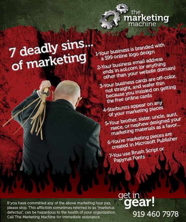
Let’s dissect a couple of these:
#1- $99 Logo: In essence a cheap and cheerful route, but you get what you pay for. It might look nice, but will it last and does it present your brand in the best possible way for what your company does and who their target audience is? The $99 route doesn’t give you all the valuable behind-the-scenes research/analysis. Professional graphic design is not just a pretty picture; it’s a well-thought-out concept based on good design practices in conjunction with brand and company research.
#3-Free Online Printing: Your company’s business cards say so much more than you might think. A good designer not only makes the cards visually pleasing (organizing the information logically and effectively, choosing just the right colors and fonts), but also decides how it should be printed. You might think that getting a cheaply printed card is a savings, but in fact, poorly printed marketing pieces have the recipient focusing on the wrong thing. The proper paper for both budget and impact, printed and cut correctly, will allow your audience to focus on the information on the card AND maybe even keep the card in their purse or on their desk longer because “it’s just so cool!”
And finally, my favorite, #7-Trendy Fonts: A professional graphic designer has an arsenal of fonts (not just the ones that came with their computer)…and knows how to use them! There’s nothing technically wrong with Brush Script or Papyrus, except that they’re overused and abused. Using the appropriate fonts for each project is one of the most important parts of a good design. The rule of thumb is that no one piece should have more than three distinct fonts. The idea being that there should be a legible body copy font and a headline and/or accent font. No more than that is needed when something is well-designed. Altering the size, weight and distribution of fonts within a piece creates the necessary hierarchy of what is important and what is less so. Using a trendy font for an entire marketing piece is overkill, and just because that font looked great on something you saw doesn’t mean it’s appropriate for what you’re doing for your own design purposes. Trendy fonts, if used, should be used sparingly to add a touch of personality.
In conclusion, if you have committed any of these deadly sins, please stop. This affliction, sometimes referred to as “marketus defectus”, can be hazardous to the health of your organization. Call The Marketing Machine for immediate assistance.
Related Posts