In the world of business, your brand is the cornerstone of your success. It's what…
Logo icon goes epic
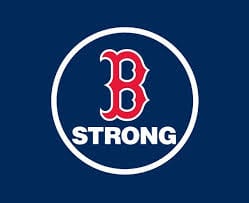
In the wake of the Boston bombings, there was an immediate need for people to show their support. Many turned to social media to post their feelings, their outrage at what had happened…others chose to use not words, but symbols. One of the ones I noticed immediately was the “Boston Strong” depicted as the “B” icon used by the Boston Red Sox™ and the word “strong”. Suddenly, this icon no longer stood for Boston Red Sox alone, but the entire city of Boston and all its people. Including those who weren’t even baseball fans… That “B” suddenly symbolized the “underdog”, the team cursed for 86 years, who finally triumphed; the city that would not give up until the people responsible for these crimes were captured.
 This got me thinking: How does an icon take on epic proportions, and why? Icons are logos or parts of logos that, after many years of recognition, can stand alone without the name of the company alongside it. An icon can only stand alone if its audience has trust in the brand and can identify with the logo as a symbol of that brand. I’m a Yankees™ fan, so for me that Boston Red Sox “B” is a symbol of my rival, of a team that will always come to play hard, and can beat us on any given day due to their talent, their heart and the city standing behind them! Legendary teams like the New York Yankees and Boston Red Sox are easily recognizable by their iconic symbols. There is much history and emotion attached to those symbols…they are no longer simply icons; they moved up to symbolic status when the emotion and history came into play.
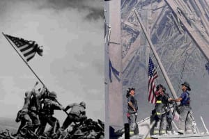 Another example of an “image” becoming a symbol of more than it originally stood for is the raising of the flag at Iwo Jima. I lived in Arlington, VA, when I first got out of college, right across the highway from the Iwo Jima Memorial. Initially for me, this was a statue of a moment in history to which I had no emotional relation. However, when the twin towers fell on 9/11 and there was a photo of the firemen raising the flag in the rubble, I suddenly recalled the Iwo Jima statue and it became a symbol for hope, a beacon of light in an otherwise hopeless situation. I was emotionally attached. That symbol was so recognizable to me that as I was driving to Washington, DC, years later, I saw a new building at the Marine Core Base Quantico come towering out of the tree tops. I immediately knew that it had been modeled after Iwo Jima…I just felt it.
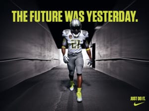 One final example of a brand that started as an icon drawn by a contest winner (who was paid a measly $75) and became an international symbol for great athletics and athletes worldwide: Nike®.No longer do we need to see the word Nike – the swoosh alone commands our recognition and respect. Not just for its products, but for those athletes that have given their hearts and souls to the games in which they compete. Nike has hand fed us the emotion we need to relate to its brand through its spokespeople: the athletes. One who comes to mind is Michael Jordan. Nike is synonymous with Jordan and athletes like him.
When we are approached at our agency to develop branding for a company, we don’t stop and think that one day it might become a symbol for something far greater, but there is always that chance. This is one of the many reasons why it’s important to take the time to create a solid, appropriate brand, both with the mark and the marketing of it. This pays off by both cultivating a trust with the brand’s audience and a path that could one day lead to brand recognition of epic proportions! View a few branding examples from our recent portfolio.
Related Posts